
As you may know the villains set was released January 31st exclusively to the Disney Stores and DisneyStore.com. From the packaging to the individual figures this set is by far my favorite!! The individual reviews will follow the order of the character assortment on the boxes. This very anticipated set has wonderful artwork that is very inviting and still maintains the villainous characteristic of the set.


The tray is well designed and very striking. The background is a dark green on green brocade with soft black borders. Ursula is the featured design on the box and outlined in light green. Of all the designs in this series it has the most attention grabbing color combination, making it the obvious choice as the “face” of the first Villains series.

The writing on the box is in teal, light green and orange which reflects some of the colors of Ursula and ties together the design of the packaging. On either side of the tray the set of eleven plus the mystery chaser is displayed and outlined in light teal. On the bottom of the case it features an orange Vinylmation graphic. Light teal lines the tray and is a dramatic contrast with the exterior of the tray. Unlike the earlier trays, this top completely detaches instead of just folding back which could be awkward. This is a much better design which was also used in Toy Story Series 1 and Animation 1 trays.


The individual boxes reflect the tray artwork with a few differences. The front of the boxes has half of the orange Vinylmation graphic. They have a much higher percentage of the box covered in writing and warnings. Half of Ursula’s head is on the side panels of the boxes. As usual, the back of the box is reserved for the character assortment and a short explanation of Vinylmation.

The bottom of the boxes provide a definition of the Villains series: “Vinylmation Disney Villains Series 1 is a collection of 12 frightening characters from Disney animated shorts and feature-length movies.”. An interesting definition, since it includes both shorts and feature-length movies but, only specifies this particular series. This leaves almost no guarantees for what to expect in the next Villains Series.


When you go to open the box the two inner flaps really set the tone and increase anticipation. The first flap reads “There’s No Turning Back”. It is followed by two smaller flaps that read “Are You Ready?” and “Prepare Yourself”. I really enjoy the first flap because all I hear when I read it is the narrator of Walt Disney World’s Haunted Mansion. The bottom flaps have no writing on them and the interior of the box is white.
The foil is also a bit thicker than the previous series and holds both the figure and artist card which is helpful in deterring people opening these in store before they buy them. The writing on the inside flaps are also slightly helpful in pre-buying opening. The boxes have no clues or codes to help you figure out who is in what box.


The artist cards are also really well done. They also have the same design as the cases and boxes. Under each figure’s picture the artist name is printed in orange and on the right side is the artist’s signature in light teal. The back of the cards have the same design as the side of the boxes with half of Ursula’s head on it without the black border. This is also how I store my artist cards. They are kept in business card protector sheets in a binder.
First up:
Cruella De Vil


I like that the artist, Dan Beltran, stayed true to the modern art of 101 Dalmations (1961). Her fur coat and crazy hair were quite convenient aspects of the character. It helps camouflage the roundedness of the vinyl and allows an accurate skinny depiction of Cruella. My favorite detail is her cigarette and the green smoke coming off of it while it’s held in between her fingers.
Prince John


He definitely makes my top four designs/characters in this series! Aside from being very true to the film (Robin Hood, 1973) and what he wore (especially in the carriage scene), I love his crazy eye and his oversized crooked crown held up by downturned ears. Enrique Pita did a wonderful job!!! He even has little black sandals and claws (though those happen to be pink).
Banzai


Not what I would have chosen for this set. I would have rather created a henchmen series so that all of my favorite minions could be made… but I guess a set of henchmen just wouldn’t sell as well. Oh well! Jim Valeri remained quite accurate to The Lion King, 1994, with this very well done design. Banzai’s facial expression is dead on! He also has quite a well designed back with the mane and all his spots. I really really really hope that they come out with a 3 inch Shenzi and Ed with a 9 inch Scar. I would freak out and jump up and down screaming like the little teenage girl I am at heart.
Ursula


One of the most detailed figures in the set, the face for the Villains 1 series, and one of four villain designs by Enrique Pita, Ursula also makes my top four designs of the series. I love the color pallet! Her menacing expression, shell necklace, detailed tentacles, and red shell earrings really bring out her personality. She even has butt cheeks (Though that is a bit more of her than I wanted to be aware of)! She is definitely up to no good!
The Little Mermaid, 1989.
Old Hag


What a very good Vinylmation adaption!! Though I would have chosen the Evil Queen over the Old Hag I have no complaints (well except I still want an official Evil Queen that is)! When looking at this you get the feeling that she is hunched over with a hump, though unlike Snow White, I do not trust her. This is a testament that it doesn’t have to be overly detailed to be a great design. Plus, ya’ gotta’ love her poison apple. Thanks for the great design Gerald Mendez! Now if I could only get the poison apple from Park Series 1…
Snow White, 1937.
Kaa


I adore this figure!! It could be that I just love the background color (teal blues are my favorite) or that I love this character especially with his hypnotic eyes! Watch out Mowgli! Kaa also makes my top four. Oskar Mendez really did a great job and I really like how he has the body wrap around the figure on it’s left side.
The Jungle Book, 1967.
Pete


Aww, Pete, it’s so cute when you’re angry!! But seriously, he is very well designed by Enrique Pita. He is the only figure in this set that from an animated short, though it is quite appropriate since he was in the first released short that Mickey Mouse appeared in (Steamboat Willie, 1928). I think my favorite feature is actually on his back: Steamboat Willie is caught in his one overall strap. It is very accurate so I believe this may be a decal.
Stromboli


I don’t think he would have been one of my first 12 choices for this set but, then again, you do have to save some of the favorite villains for upcoming series. He is very well done and true to the character, just not one of my favorite villains. The red ears are supposed to be curtains. Designed by Jim Valeri.
Pinocchio, 1940.
Madam Mim


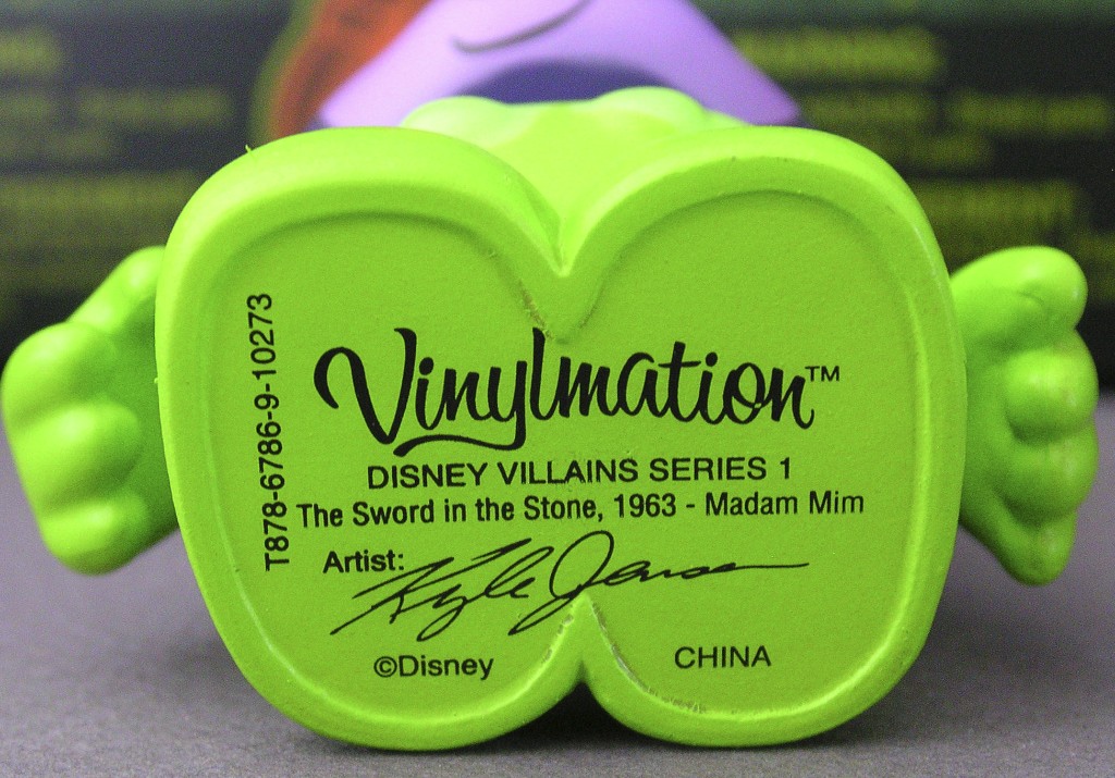
I was so looking forward to her design and then I saw the drawing of her design… I was in denial, I thought “oh well maybe it’ll look better in person”. No, I’m sorry it doesn’t. Please Please Please don’t get me wrong, her face and head area is GREAT it’s just what’s with the “sparkly” green cloud? I’ll give Kyle Jenson the benefit of the doubt that he had a really freaking AWESOME design of her during the transformation but due to production problems they couldn’t create it and it was too close to the deadline to properly fix. Unfortunately, the end result just looks like they phoned it in. Though I will still be on the hunt to get the Animation Series’ 9 inch Merlin to go with her.
The Sword and the Stone, 1963.
Governor Ratcliffe


Once again not one of my favorite villains but his face is so evil and is sooooo accurate it looks JUST like a screen shot! Great shading!! He even has his little pigtails with red bows flowing down his back. Awesome job Enrique Pita!!
Pocahontas, 1995.
Shan-Yu


I knew who he was when I saw him just because I am so obsessed with Disney, not just Vinylmation. Perhaps it could be a hint that you choose a rather unpopular villain when you actually have to write his name not only on the bottom of his feet just like all of the others in this series, but also ON THE BACK OF HIS HEAD. His face and expression are really well done and I don’t even mind the Chinese symbols on the ears but, the name on the back of the head really detracts from his design. Sorry, Dan Beltran. At least your design of Cruella is more in the series.
Mulan, 1998.
Jafar


The final design in my top four for this series! Although he doesn’t follow the same formula as the others in the series, it really works for him. I LOVE that Kyle Jensen made the Vinylmation head the turban. He also accomplished the task of maintaining his skinny build on a bulbous figure. Though the yellow rings on the gloves of the vinyl figure have nothing to do with the actual character, I do agree that they are needed to balance the composition. In light of the Animation series variants I was half hoping for a variant of Jafar in his sultan robes...Darn! Plus I still want a 9 inch Jafar genie!
Aladdin, 1992
I absolutely love this series and can't wait for the second series to be announced! Though there are a few quality control issues, many of these are now some of my all-time favorites!!
I absolutely love this series and can't wait for the second series to be announced! Though there are a few quality control issues, many of these are now some of my all-time favorites!!
No comments:
Post a Comment